Youtube Cookie Consent Dark Pattern
Posted on
This has been posted as part of Blaugust 2026!
Sometimes you just wanna post about the small stuff, y'know?
Okay, look, before I get started, maybe this is just me. Probably this is just me, it's just the last couple of phones I've had and I'm making something out of nothing here, but... okay, I can't prove it, however I am convinced the YouTube cookie popup on a mobile web browser has been intentionally engineered to enable an increased rate of accidental "Accept all" button taps.
I know, stop the presses right?
Indulge me this minor, relatively inconsequential theory, don your tinfoil headwear and your accurate glass-prodding finger of choice, and follow me as I navigate to youtube.com on Firefox in incognito mode:
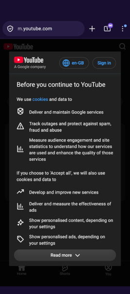
Oh look, a tasty cookie consent popup! There's a convenient little "Read more" button at the bottom of it, how thoughtful. If you decide to tap it instead of scrape your digit of choice down your screen, the text doesn't scroll all the way down, just most of the way down. It scrolls down enough to have the "Accept all" button peeking out from behind the top of the Read more button. Well, at least for me it does.
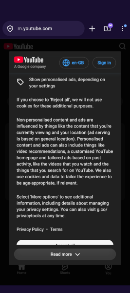
See that white bar just about the "Read more" button? That's a big "Accept all" button
At this point in your cookie refusal journey, you'll tap Read more one final time, but if you tap the screen slightly off and above the Read more button, you'll end up tapping "Accept all", giving Youtube/Google/Alphabet permission to harness, extract, analyse, and sell every iota of data about you during this visit and any future visit if you're not clearing your cache or in incognito mode.
Is this just me being unlucky? Does my resolution and screen size just happen to cause this innocent little quirk?
I guarantee you that people have mistakenly tapped this button at this stage, because I have. Several times! I am pedantic and pissed off enough to manually untick or decline every cookie banner I see, or dig into the website settings to unapprove any assumed consent, or bypass page blocking cookie banners entirely. I'm not sure many other people could be bothered, and to them I say install a browser extension that auto-declines all this crap. Living a noscript life is not for everyone but you can make this stuff mostly go away!
Whilst I'm here, did the "Reject all" and "Accept all" buttons on youtube.com in a desktop browser swap around at one point? I don't know if or when this happened, but I have muscle memory taking my cursor to the middle button instead of the left button every darn time.
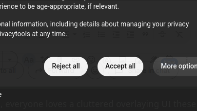
I'm CONVINCED those two Reject/Accept buttons have swapped place at some point. Right?! Someone back me up here!
Every mis-tap is more revenue for YouTube to earn from that point on. I can imagine plenty of Big Business money types intentionally researching ways to have people accidentally accept or agree to things like this. In fact, they're so common that the technique has a name! They're called Dark Patterns (there's even a website dedicated to them, deceptive.design), and I wouldn't be surprised if Google et al have done loads of research into this. Surely Google, arguably one of the leaders in web interface design, wouldn't allow any of their interfaces, especially one with legal weight behind it, to look like this by accident, right?
Then again...
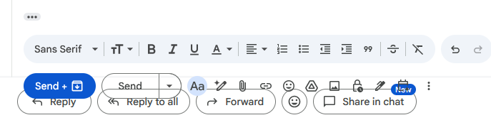
Good job there, Google, everyone loves a cluttered overlaying UI these days.